Every architect started as a student. Even the famous ones had a first house or building, their first contract which led them to decades of work, and appreciation. Every year, students graduate from architectural colleges. They can be the fresh perspectives that shift styles and set new trends. Look at what they’re doing, get a glimpse of a very near future, and maybe meet someone with a perspective to work with.
The following four projects are from the University of Washington’s Department of Architecture. Students worked on individual designs within a group’s larger project. The projects were large, and typically public spaces. Maybe that was to make sure there was enough work for everyone. One theme either consciously or subconsciously wove through the results: a strong preference for modern design. Modernism continues.

Live/Work
“Students were challenged to consider living and working environments and combine them into a single building design in an urban context.”

Life and work aren’t two separate things for many people. Whether it’s because someone decides to work alone, or because a company decided to encourage people to work at home, living spaces and work spaces are merging. Check through the listings and find that new houses are including multiple offices. That may seem odd, but go back a hundred years and find that houses typically had only one bathroom, not the one per bedroom which has become the unspoken standard. Why not one office per bedroom?

The project took the integration of life and work one step further. Purposely design a space that blends the two. As a model, they created a building for a video artist. In at least one version, the living space is on the top floor. The middle floor holds the work space. Independent artists need to do more than produce, they must also market and advertise. The lowest floor allows visitors to experience the productions without interrupting the work. The design draws attention to the work, not to the building.

Mountain Hut
“This studio will focus on the site and building design of a remote mountain hut to be located high in the Cascade Mountains in Washington State.”

Huts sound small, but mountain huts can grow to the size of small hotels, or at least small hostels. The idea isn’t as common in the US, but Europe and New Zealand are known for networks of huts that accommodate hikers, skiers, and people that are happy to sit and watch the scenery. Siting one in the Cascades is a challenge, and one that benefits from non-traditional approaches.

Modern style makes surprisingly good sense. Simple designs and simple construction can make it easier to fit into a short construction season. Walls of windows are a natural in nature. Why head to the mountains if it means hiding in dark rooms? Elevating the building on stilts is a defense against big and small creatures, keeps the building above the snow, and makes the views that of vistas and forests instead of arrays of trees.

Public Lab
“This studio is a real-life design challenge to research, envision and present an integrated proposal for a new Welcome & Event Center at the University of Washington’s Friday Harbor Laboratory (FHL) site on San Juan Island.”

The Friday Harbor Laboratory is already a distinctive building set into a beautiful natural setting. As a destination, it could benefit from having a place for visitors to enjoy without interrupting the work. Designing a Welcome & Event Center that compliments the existing structures raises the difficulty level.

One proposal looks like it was inspired by a ship’s hull. There’s even an extension from the roof that looks like a futuristic bowsprit. The angular design puts more space above than below. Angular panes break convention. A large open space makes it easier for tour groups and school field trips to gather for talks. At night, a large open space becomes an event center, increasing utilization, possibly generating revenue, and benefiting the community.

Nature Retreat
“Students will propose an intervention for one of three representative site conditions found at Discovery Park in Seattle.”

Think of it as the seaside and day-use version of the mountain hut mentioned above. Discovery Park waits to be discovered, and people do, but more might if they knew there was a place to get out of the weather or find a better vantage. One size does not fit all, and the diversity of locales within the park suggests the need for diverse solutions.

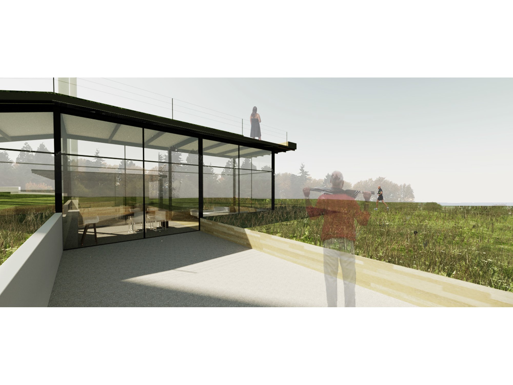
In the forest, the emphasis may be on quiet contemplation. In the field, a bit of elevation improves the view. By the shore, find a balance and the right site between the sand and the bluff. The forest site can’t challenge the trees for height, so don’t try. A better vantage in the field is appreciated, but blend it in with a living roof and lot of glass. Warm days on the beach benefit from being able to sit outside and listen to the wind and waves. Each solution is minimalistic, simple modernity sitting with nature.

Summary
Simplicity and minimalism pervade the designs. Looking at the rest of the student projects, it looks like Modern is the preference. There are no classical Greek columns or fanciful Victorian filigree. The function of the buildings helped determine their form whether that is urban, wilderness, marine, or parkland.
For details, contact UW. Don’t be surprised to learn that the students have moved on. That’s what students do. It may be worth tracking them down. They’re moving into their careers, but they’re also moving the styles and attitudes. Another generation making modern more modern, again.
