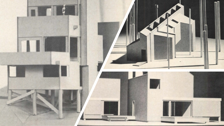
Modern design has done an impressive job at remaining modern, even after 50 years. Dig into architecture magazines from 1969. There’s a refreshing amount of familiar material, and then there’s the unbelievable. Remember asbestos? Some ideas sounded good at the time. Others still do.
We were just about to land on the moon. A manned mission had just flown around it. Already there was talk about moving onto Mars. The 747 was heralded as the beginning of the second jet revolution with supersonic transports soon to follow The Space Race encouraged sleek designs and futuristic thinking. It was also the end of the Sixties, a time of tie-dye, Peter Max, macrame, and experimental solutions to housing, social issues, and a search for new materials. Expressive designers played with wild patterns, carved ornamentation, and old ideas in new forms – like conical fireplaces.
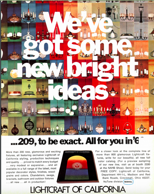
A house may have clean lines outside, but exuberant colors inside. It was an era for avocado and turquoise.
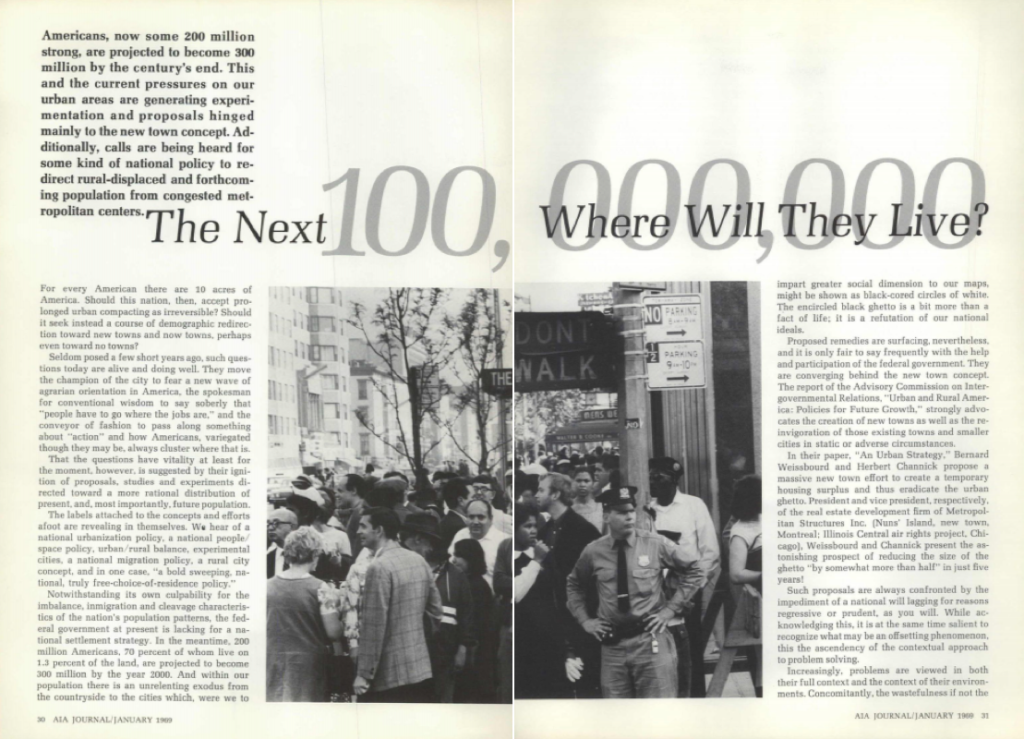
Planners realized the US population would grow from two hundred million to three hundred million within a few decades. Where would we put everyone? Density was already considered high, with a national average of one person for every ten acres, which seemed extreme for a nation known for its wide open spaces. An extra hundred million would require densification at the same time that urban flight was inspiring a “Save Our Cities” campaign.
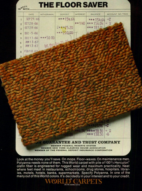
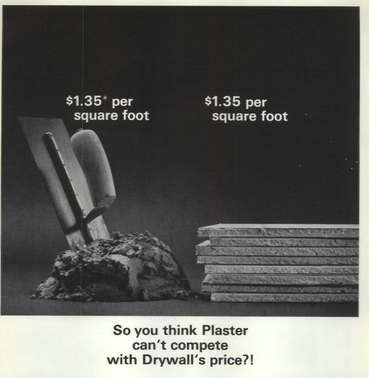
Building enough homes for a hundred million people meant a need for more financing, contractors, and materials and methods. Plaster was finally being replaced with drywall, inside. Vinyl was coating the outside. Formica was taking over from tile. Carpets were being laid as adhesive squares. Brass was big. Showers, to be equipped with flexible showerheads, were produced as one-piece of plastic ready to be placed in a corner. Even saunas could be part of the house with far less effort. Pre-hung doors were a time-saving innovation.
Affordable housing was also an issue. More houses weren’t enough. Enough of them had to be affordable, too. Fair housing and civil rights encouraged alternatives to tenements. The same philosophy of new materials and pre-fabrication were being explored for entire structures. Could modular homes solve many of the issues? They required fewer workers because they could be put together like giant TinkerToys. Mass production provided cost savings through economy of scale. Modular became popular for everything from houses on wheels to small houses to apartments to high-rises. Sound familiar?
Inside, everything seemed to be hyphenated: built-in, labor-saving, space-saving, self-cleaning, side-by-side, etc. The old traditional kitchen was replaced by the new traditional kitchen. Knobs and switches ruled the workspaces. Dishwashers, garbage disposals, and induction cooktops were fresh ideas. It would take decades before the controls were flush-mounted and easy-to-clean.
The game room was filled with boxes for board games, not electronics. A prototype electronic game room was developed, but it was wrapped around an IBM mainframe. Imagine that user manual.
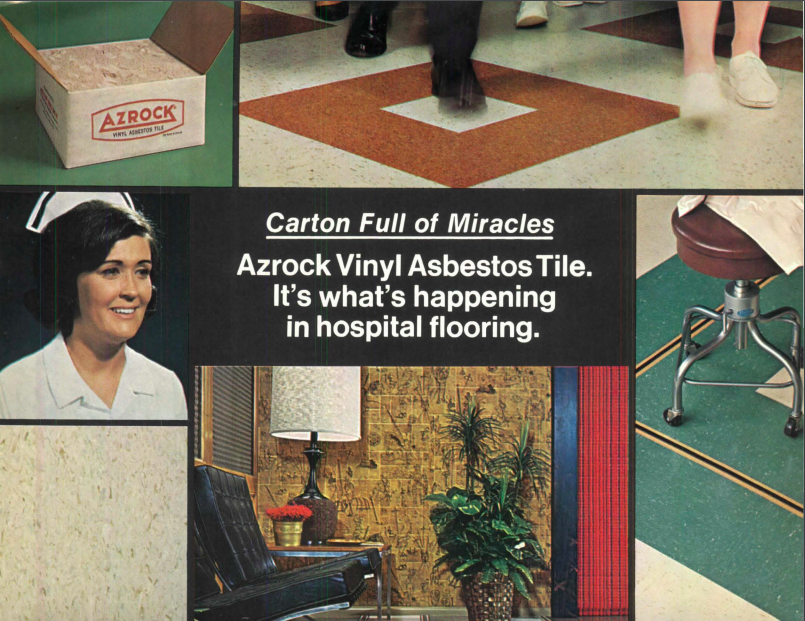
A few ideas are probably left in the past. Vinyl tackboards were designed so entire walls could become bulletin boards for families, dozens of notes held in place by thumb tacks. Asphalt shangles adorned the outside of second story low-rises, something that can still be seen by driving around the right neighborhoods. Fake ceiling beams were sold as an easy way to help houses sell faster. And then there was asbestos, a great idea for fire-protection that ultimately wasn’t great for so many other reasons.
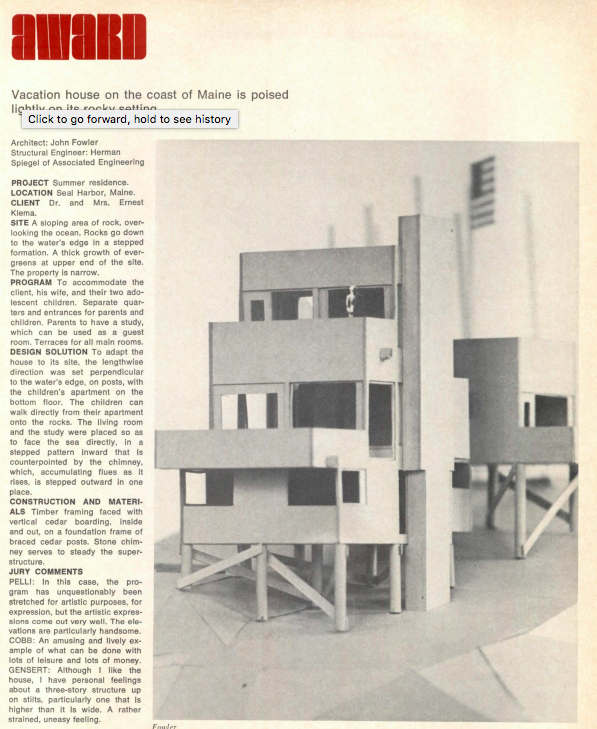
Good modern design is timeless, but timeless is only tested over time. Look back fifty years by looking at fifty year old homes and see ideas that proved themselves. The best look current, sleek, and clean. Inside, though, don’t be surprised that Formica has been replaced with recycled glass, appliances became educated, and the colors, well, the colors may be back in style.
