Forty years ago modern design looked similar on the outside but a lot was changing inside houses and buildings. In 1979, we were entering yet another new modern era by choice and necessity. Have fun playing with the intercom, and watch out for those glowing Exit signs.
We watched and waited as the Space Shuttle caught everyone’s attention, even as we put the Moon aside for a while. Star Wars made us wonder about what would come next. We were also leaving Watergate and the Vietnam War in the past. Disco was taking over from hippies. A couple of oil crises meant energy efficiency was a hot topic, inspiring innovations like solar power. Affordable housing was an issue, not because of house prices, but because interest and inflation rates were around 13 percent and didn’t look like they’d change quickly. A curiosity called an Apple thrilled a few hobbyists, but nothing much was expected from it.
Architects were busy responding to the federal government’s response to energy, safety, and affordability.
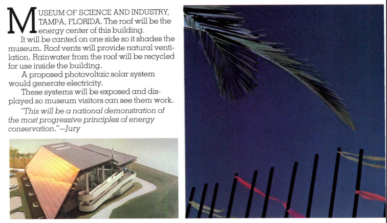
Federal Energy Standards reflected the need to lower oil imports, as well as pollution output. Clients demanded lower energy bills. Solar power was attractive so it was incorporated into designs, but the particular solutions weren’t obvious. Solar panels met a lot of the criteria and were a visible declaration of intent; but the panels were expensive and inefficient. Instead, designers were encouraging the use of passive designs like skylights, bermed walls, and the intelligent use of glass and shades. It was the ad hoc launch of the Solar Era in Design. Despite the exotic efforts, simple ideas like insulation were easier, effective, and cheaper.
Safe housing has always been a concern, but particularly in commercial spaces there were new considerations thanks to OSHA, the Occupational Safety and Health Administration. Many of the ideas were already in use, but panic bars, wider doorways, safety rails, a multitude of improvements needed to be addressed and instituted more broadly. More work meeting regulations that took time away from advancing aesthetics.
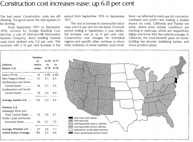
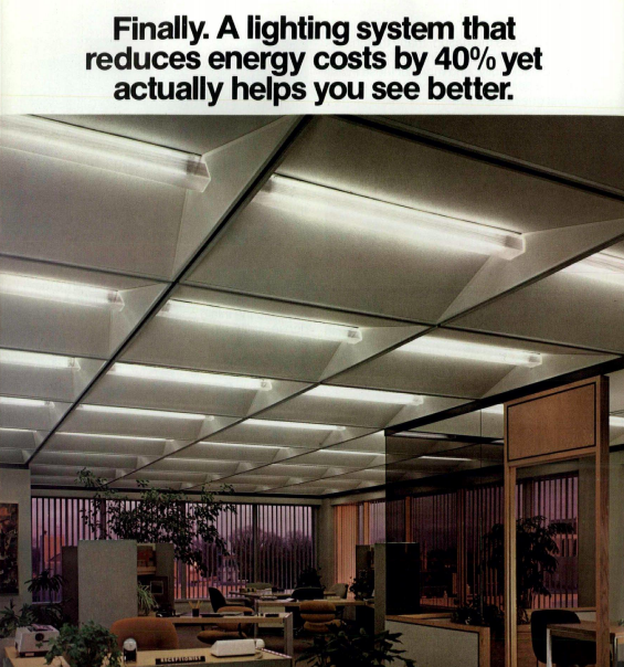
Macroeconomic affordability issues were the realm of economists and financiers, not architects. Interest and inflation rates are worked with different tools. Architects could, however, make houses more affordable through energy efficiency, new materials, and new methods. Maybe a condo made more sense than a house. Windows had an easy solution: replace single-paned with double-paned, and in some environments go to triple-paned windows. Heating systems weren’t just oil versus electric. Natural gas sounded more natural and was less likely to be imported. Heat pumps for homes became more popular. Even fireplace efficiency was being improved, yet another non-imported and relatively cheap source of heat. One of the simplest yet more effective innovations was the 1979 version of a programmable thermostat.
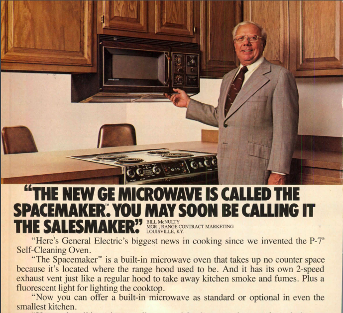
Advances in comfort and convenience continued. Jetted tubs were becoming affordable, or at least available, luxury. Labor-saving straddled the definitions of luxury versus necessity. Self-cleaning ovens and glass cooktops saved cleaning time. By extension, microwave ovens saved even more, especially as lifestyles sped up. Refrigerators with in-door water and ice dispensers saved energy while also providing nearly instant gratification. Trash compactors meant fewer bugs and fewer trips to the curb. Stainless steel sinks, plastic laminate counters, and vinyl, vinyl, vinyl made cleanup much easier; though good oaken cabinets continued to be popular. House sizes were growing, but fitting all the extra appliances in the kitchen encouraged the use of compact appliances.
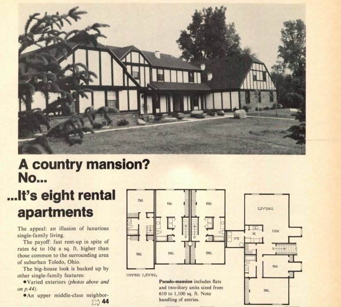
Lifestyles were changing. The industry was finally realizing that first time homebuyers weren’t always a husband with a growing career, a housewife, and two or three kids with a few pets. That realization began to affect everything from design, to finance, to even what some rooms would be called. Though Master suites, Mother-in-Law apartments, and his-and-hers whatevers continued to exist. Room had to be made for the equipment (and toys) that supported the exercise craze. Bicycles weren’t just for kids or play. The parents might use them to commute and shop.
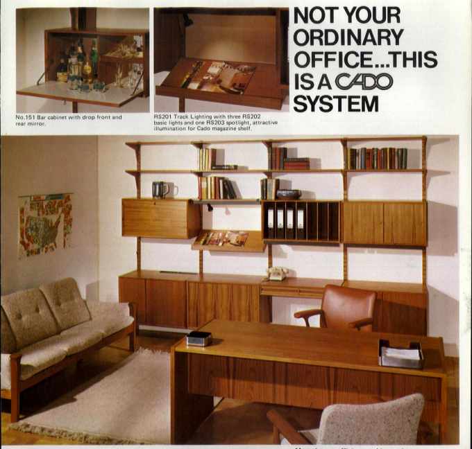
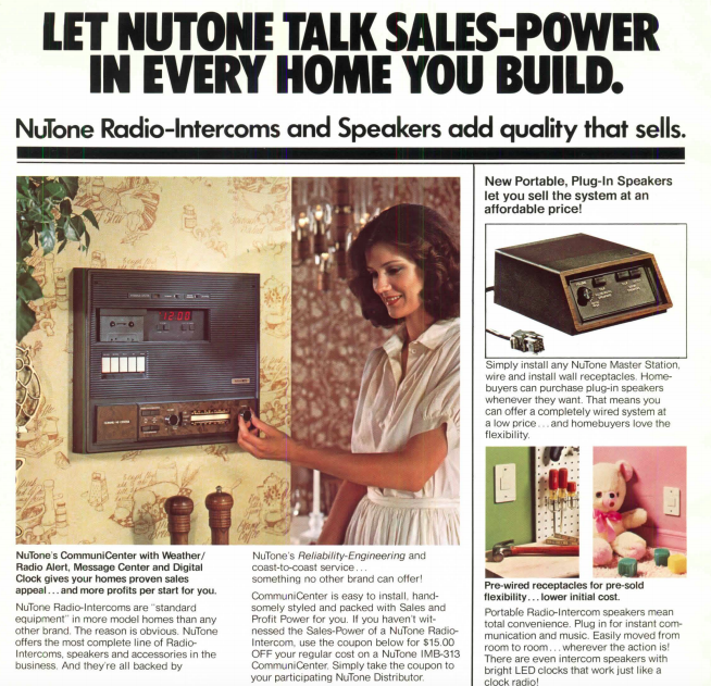
Some ideas seemed right for the time, and maybe they were. Track lighting was stylish and efficient, and a nice rebellion against conventional design. Digital clocks were red-eyed marvels because they were noise-free, accurate, and easy to read at night. The height of technological advancement, the standout feature of some homes were Electronic Information Management systems. Don’t jump ahead to what seems obvious, now. These systems connected the entire house but without the use of computers. It was the time of analog systems: radio, cassette player, and an intercom wired throughout the house. It might even include one of those digital clocks, either the red-eyed version or one that flipped a new number every minute. The fanciest ones may include a turntable that folded out from the wall.
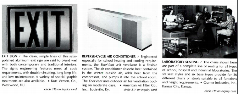
One idea that didn’t last as long was a possible answer to OSHA that was also a contradiction: exit signs, specifically nuclear-powered exit signs. They glow! As if from a movie, they were powered with tritium from a company called American Atomics. Even the name sounded sci-fi, but was real.
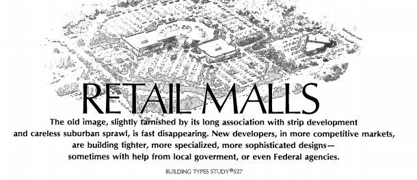
Forty years ago was also an era when modern art was being accepted as public art, shopping malls were becoming enclosed havens for communities, and cubicles were occupying office spaces. Living in the desert was becoming easier and more affordable. People were living, shopping, and working in new environments.
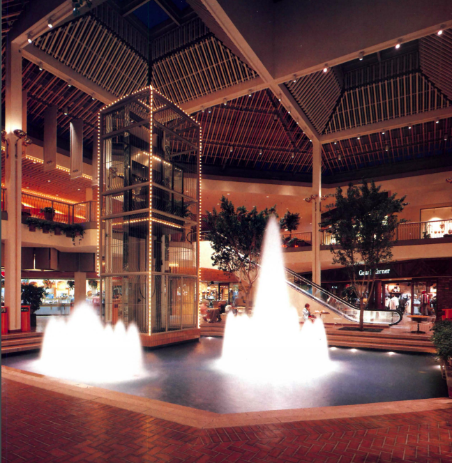
On the outside, little may have changed except modern design was more widely accepted. On the inside, modern design was testing advances and innovations that are now implicitly incorporated leaving designers more time to think just as much about form as function. How will today’s designs look and work in 2059?
Read earlier articles in this series: