360Modern takes a dive into the the Seattle Central Library in the city’s downtown, an edifice that commands attention for its singularly Modern design.
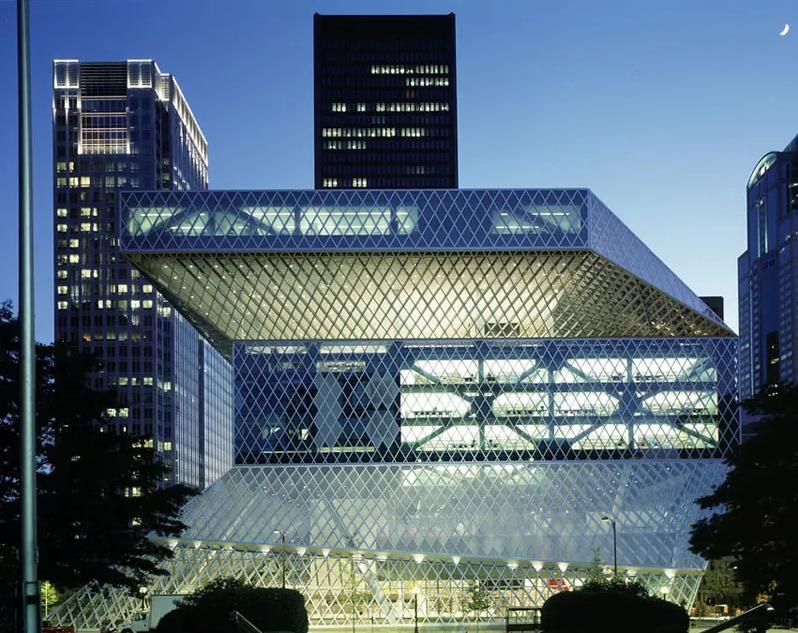
Eleven shining stories of glass and steel stand square in the middle of downtown Seattle, housing centuries of thoughts, words and ideas. Don’t let the history inside fool you, though, because this sleek building is nothing less than a contemporary take on the notion of a public library. Gone are the days where libraries can get away with dark interiors and musty carpeting, as the 2004 OMA (Office for Metropolitan Architecture) team of Rem Koolhaas and Joshua Prince-Ramus ushered in this geometric landmark instead.
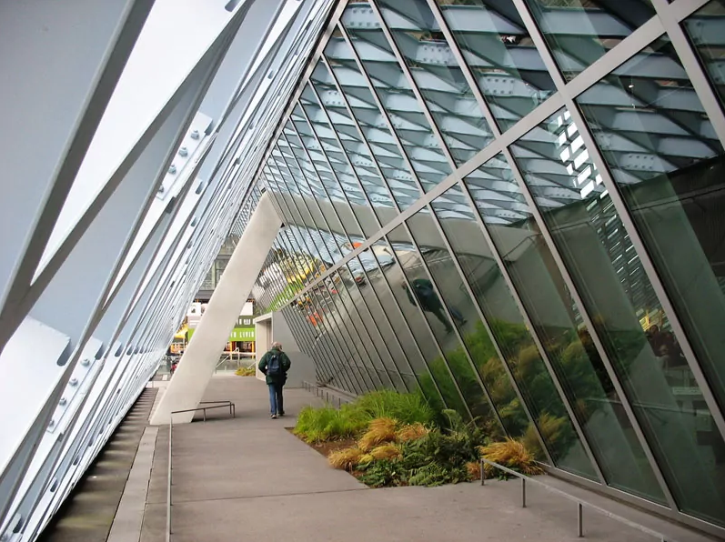
This is not your average library. As one approaches the building, it’s nearly impossible not to be gripped by the diamond-lattice envelope that wraps the building, with dynamic blocked tiers that cast striking shadows across the facade. Once inside, the modern interiors fast track visitors to a headspace of attentive curiosity by way of other-worldly interiors—the Red Hallway, as it’s known, glows a high-gloss cherry red, a walkway made entirely of glass. Suddenly immersed in a space that is so considered, those inside the building find themselves paying attention to details that normally get overlooked, from hand railings to seating options to the way a walking path leads you from one space to the next.
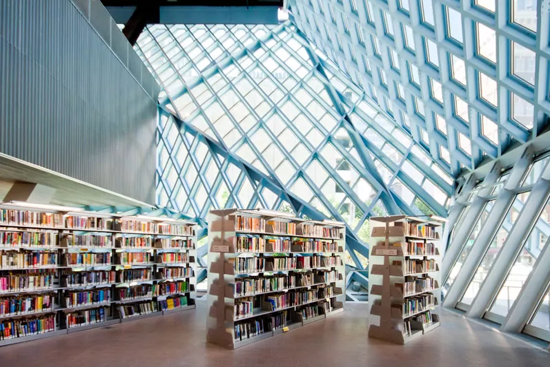
The presence of books is certainly an important one—but as much as can be learned from burying one’s nose in a book, the Seattle Central Library fosters congregation and observation as much as traditional reading. Rather than embracing the traditional layout of tray upon tray of archival stacks, the architects of the Seattle Central Library opted for what they call “The Book Spiral,” a continuous ribbon of nonfiction shelving that snakes around the perimeter of the building, leaving a central column open to serve as an atrium. The space is filled with ample light and a soft hum of sound from the floor below. Beyond the books is the “Living Room,” an awe-inspiring space with a dramatically slanted ceiling, like a terminal in the sky—vast floorspace and streams of light create a playground of possibility for architecture enthusiasts and bibliophiles alike.
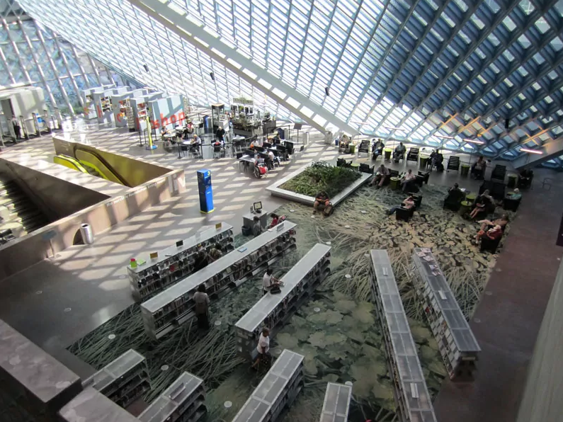
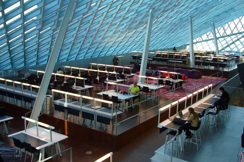
In an era where information can be accessed from anywhere, architects Koolhaas and Prince-Ramus argue, the library would need to serve as more than a place to house just books—the spaces within the building needed to be flexible, multi-purpose, even, in order to accommodate new and innovative ways of learning and gathering, especially those that come by way of a WiFi signal. And oh, what a job they did. Despite having been opened to the public in May 2004, the building perches on the cusp of the future, owed to a high-octane design and a material language of glass, steel, and plenty of light. The city’s flagship public library makes a tremendous statement in the name of architectural design, driven by a geometry and super-sleek interiors that feel intergalactic at times, and at others they strike with a great scale that humbles visitors.
Images via designrulsz.com